60 FPS: Performant web animations for optimal UX
Silky smooth interactions are critical for providing a natural-feeling application. The devil is in the details, and ill-performant web animations feel awkward, “janky”, and, above all, slow. Front-end developers often invest quite a bit of time to reduce first page loads by even a few milliseconds, but forget to consider the impact of the interactions that follow.
Like many front-end developers, I’d consider myself user experience obsessed. Performance is a crucial part of our formula for a stellar user experience: just as a speedy search leads to happy users, so do performant web animations.
Measuring success with frame rates
You can use the frame rate of an animation object to measure how responsive an application feels. 60 frames per second is the generally accepted target for achieving a “natural” feel. What this means for developers is there are roughly only 16.7ms (1000 milliseconds divided by 60) to achieve all the work that has to happen in each frame. Consequently, the overarching goal is to limit the amount of necessary work.
As with all things in life, this principle comes with a caveat: more frames means more processing, which means frames might be dropped. If all the updates necessary won’t fit into the 16.7ms time allotted, it might be better to deliver lower frame rates (30fps) more consistently.
Browser 101: How a Pixel Is Born
Before diving too far into the nitty-gritty, it’s important to take a step back and ask: how is the browser actually generating the pixels a user sees from the code you write?
On initial load of the web page, the browser downloads and parses the HTML, and then converts elements into a “content tree” of DOM nodes. Additionally, style information gets parsed and calculated to generate the “render tree”. In the interest of efficiency, the rendering engine may split up the work that needs to be done, and certain parts of the render tree may be built before all the HTML is done being parsed.
Layout
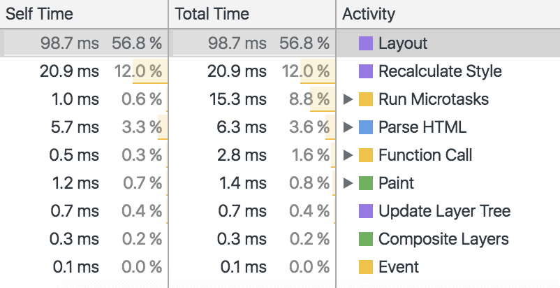
Once the render tree is completed, the position and size of elements on the web page is recursively calculated from the top left corner to create the layout. This computation can generally be accomplished in one pass, however, it may require additional passes depending on the flow of elements. Element placement is highly interdependent. In order to optimize the necessary work, the browser tracks changes and marks these elements and their children as “dirty”. However, due to the heavy correlation between elements, any layout changes will be quite expensive and should be avoided.
Paint
After the layout is created, content is displayed on the screen by the painting process. During this step, visual styles are used to paint the page according to the correct visual formatting model. Similarly to the layout process, “dirty” elements are tracked and consolidated into one larger rectangle. Re-paints will only occur once per frame to redraw this “dirty” region. As such, re-paints require a large amount of work and should be avoided.
Composite
In the final step, all the painted elements are composited. By default, all elements are painted into a single memory layer; however, by separating elements onto compositor layers, updates will only affect the elements on their respective layer. The CPU draws the layers, while the GPU generates the layers. Hardware-accelerated compositing is incredibly efficient at basic drawing operations. The separation of layers allows for non-destructive changes. As you may have guessed, changes to GPU-composited layers are the least expensive.
Getting creative with compositing
As composite-level changes are the most performant, the only properties that should ever be changed are those that only trigger compositing. These properties are opacity and transform. Seriously, that’s it. However, this isn’t as limiting as it might first seem — you will just have to get a bit creative.
Transformation
Transformation allows for endless possibilities of visual changes to an element: you can position it (translateX, translateY, or translate3d), scale it, rotate it, skew it, or even apply a 3-dimensional matrix transformation. In some cases, you might need to shift your thinking and consider how a change that would cause a re-layout or re-paint could be achieved with a transformation.
As a quick contrived example, consider the case of a “box” element that is shifted to the left 10 pixels when an “active” class is applied.
Instead of changing the “left” property (like below):
Consider translating the element across the x-axis:
Opacity
By changing opacity level, you can easily show and hide elements (similar to changing “display” or “visibility” properties, but much more performant). Consider the case of a mobile menu toggle animation: in its open state, the menu will have an opacity of “1”. However, when it’s closed, its opacity will be “0”. It’s also best practice to define pointer-events as “none” to ensure a user doesn’t accidentally interact with the “hidden” menu. The “closed” class should be toggled as a user clicks the either “open” or “close” buttons. Here’s the respective code:
Additionally, opacity changes allow you to control the visibility level of an element. Again, this requires a bit of thinking outside the box, but can be quite powerful. For example, rather than animating an element’s box shadow directly, you can instead alter the opacity of a pseudo-element containing the box shadow. Here’s an illustrative code snippet:
This can instead be written as:
Manually promoting an element to its own compositor layer
There’s even better news— you have control even beyond which properties you select. It’s possible to manually promote elements to their own compositor layer. By forcing promotion, you can ensure an element is always painted and ready. This is an easy way to inform the browser which elements will need a little more help — that is, any animation effects that are paint expensive. This includes any element that will be changed (i.e., animated in some manner). Certain styles (such as: position: fixed and overflow: scroll) are quite expensive as well. You’ve probably seen bugs come up in the past with elements that “shimmy”, “flicker”, or simply don’t behave as expected. It’s common to see fixed headers on mobile blink as a user tries to scroll down the page. Promoting these elements is an easy fix for these types of issues.
The Hacky Method
Previously, front-end developers were forced to “trick” the browser into promoting elements by applying styles that would trigger a new compositor layer but wouldn’t necessarily have a visual effect. Generally, this was achieved with either backface-visibility: hidden or transform: translate3d(0,0,0).
The New, Shiny Method
Fortunately, browsers (Firefox, Chrome, Safari, et al.) now provide an explicit property to inform browsers what types of optimizations will be needed ahead of time called will-change. You can provide varying values such as a list of properties (“transform, opacity”), “contents”, or “scroll-position”. Perhaps most useful is “auto”, which will apply the default, standard optimizations. A quick example:
As in all things, however, moderation is important. There is such a thing as too many composited layers. The browser already does its best to optimize, and will-change optimizations are resource heavy. Using will-change implies an element is always moments away from changing. This is especially important on mobile — many composited layers can have a noticeable negative performance impact.
Web animation methods
There are two ways to animate elements: using either CSS (declarative) or JavaScript (imperative). Which one you choose depends on how you need to best accomplish your goal.
Declarative web animations with CSS
As CSS animations are declarative (you tell the browser what to do), the browser knows the full extent of the operation, and thus the end point. As a result, it can make optimizations. Additionally, CSS animations run off the main thread, and prevent blocking more potentially important work. Generally speaking, CSS animations will be the more performant option. Keyframes in combination with web animations can provide many powerful options for interesting visual effects. Here’s a small code snippet for rotating an element infinitely:
That said, CSS animations lack the expressive power of JavaScript. One possible solution is to use JavaScript to listen for user input and toggle a class based off the action. This class can then contain the necessary styles for the web animation. Here’s a quick example that shows how to toggle a “class-name” on a box when it has been clicked.
It’s also worth mentioning that if you’re operating on the bleeding edge, the new Web Animations API allows you to harness the performance of CSS, within JavaScript. Using the API, you can easily handle synchronization and timing of web animations while still taking advantage of the perks of the CSS approach.
Imperative web animations with JavaScript
Imperative web animations tell the browser how to perform the web animation. In cases where CSS animations would grow too unwieldy or when more control is needed, JavaScript should be used. It should be noted that, unlike CSS animations, JavaScript animations will be run on the main thread (and as a result are more likely to drop frames), and are generally the less performant option. That said, there are a few options to consider when JavaScript animations are needed.
requestAnimationFrame
One option to allow the browser to optimize for performance is requestAnimationFrame. You can consider it the setTimeout of the modern age; essentially, it’s a native API for running an animation. It will theoretically be called at 60fps, however, in practice it requests web animation drawings at the next available opportunity — there is no set interval. The browser optimizes by grouping changes into a single repaint, which saves on CPU cycles.
It can be called recursively:
Additionally, you should consider leveraging requestAnimationFrame for performance-intensive events like resize or scroll (as opposed to binding directly to the event).
Scroll Performance
Speaking of scroll, achieving smooth scrolling performance presents its own challenge. Fortunately, a few recent additions to the specs provide further options for fine-tuning. Passive event listeners enable you to improve scroll performance by indicating to the browser that preventDefault will never be needed (which eliminates the need for scrolling to block on touch and wheel event listeners). Usage is as easy as specifying {passive: true} on a listener. });
Starting in Chrome 56, this option will actually be default for touchmove and touchstart.
Additionally, the new Intersection Observer API allows you to easily determine when an element has entered or exited the viewport, or intersected with another element. Rather than clogging up the main thread with event handlers waiting on an explicit intersection, the Intersection Observer allows you to execute any work needed only when monitored elements cross paths. This is particularly useful for creating infinite scroll or lazy-loading experiences.
Read, then Write
The correct term for the side effects of back and forth reading and writing to the DOM is “forced synchronous layouts”, and when done in quick succession it’s known by the more illustrative term “layout thrashing”. As mentioned previously, the browser tracks “dirty” elements and queues up changes until necessary. By reading certain properties, you force the browser to perform premature calculations. This back and forth of read / write will cause reflows. Fortunately, this anti-pattern has an easy fix: read, and then write.
To illustrate this, here’s a contrived example where the layout is read/written to rather harshly:
Instead of reading and writing at every iteration, it’s better to read outside the “forEach” method:
The Future of Optimization
Now, browsers support more and more options for fine-tuning performance. One new property (currently supported in Chrome and Opera!) called contain, which we use extensively in InstantSearch, allows you to indicate that an element’s subtree is independent from the rest of the page. Essentially, this is an easy way to tell the browser that it’s safe to optimize an element. You can specify as values strict (for all rules), content, size, layout, style, or paint to limit the scope of any changes. This will ensure that DOM updates in the subtree do not trigger reflows on the parent document. In particular, this can be useful for third party widgets that you lack control over. A quick example:
Web application performance testing
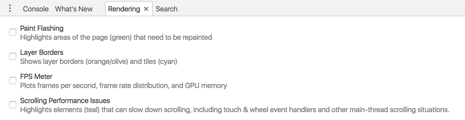
While knowing how to optimize is all well and good, it’s important to test your app’s performance as well. The best tool (in my humble opinion) is by far Chrome developer tools. Hidden away under “More Tools”, the “Rendering” pane offers several options including tracking “dirty” elements, calculating frames per second, and highlighting layer borders and scroll performance issues.
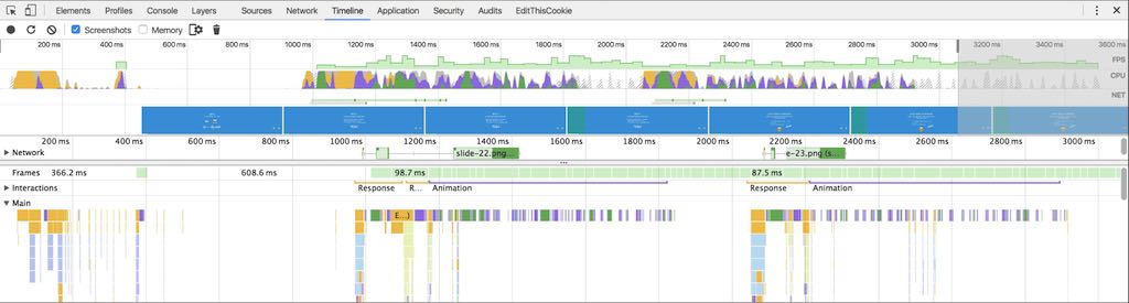
Additionally, the “Timeline” tool (under the “Performance” tab) allows you to run animations and then drill down into problem areas. The main gist here is: “red” is bad, “green” is good. You can actually click into red areas and determine which functions are most problematic.
Another interesting option (hidden under the “Capture Settings” section) is “CPU throttling”. Using this setting, you can apply a slowdown multiplier to measure the impact on performance. This is particularly useful for testing how existing and new animations will run on mobile not only web pages. While the FPS might be quite good on desktop, it’s always important to consider other less powerful devices.
Test and Iterate
The easiest way to optimize web animation performance is to reduce the amount of work needed in each frame. The most efficient way to reduce this workload is to only need updates to elements on composite layers, as these changes will be non-destructive. That said, sometimes you’ll have to get a little hacky and think outside the box. Performance fine-tuning is often a game of testing and iterating — but in the end, your users will thank you.